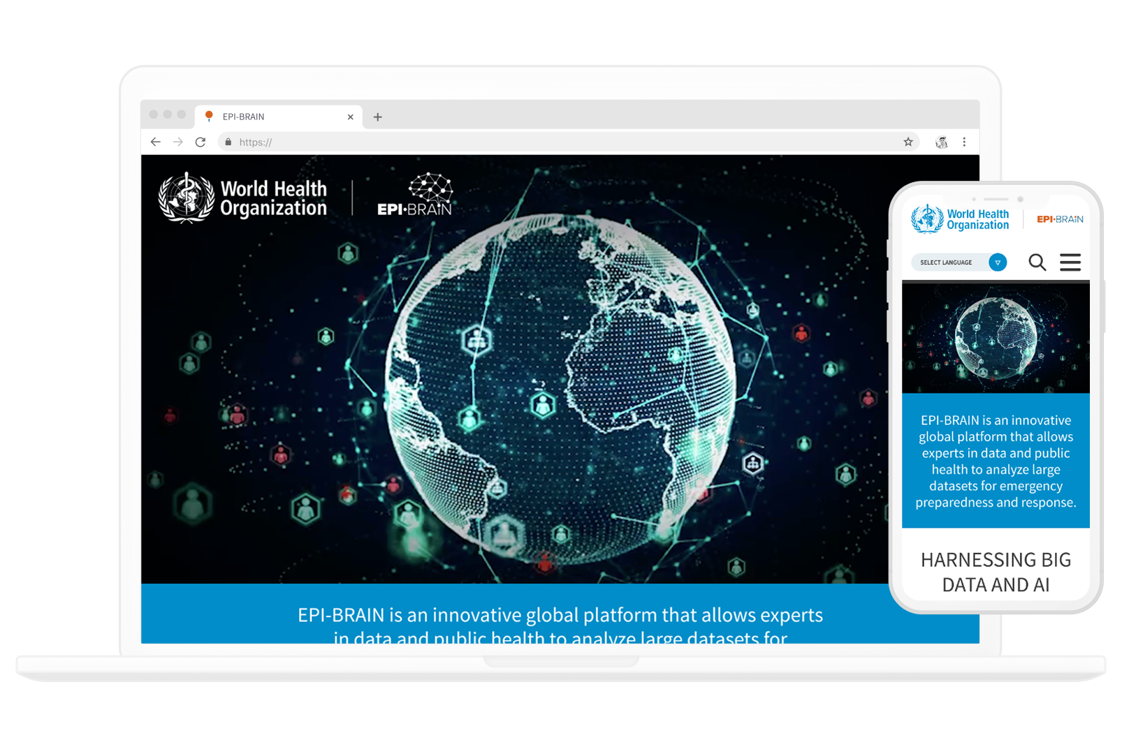
The identity needed to be scientific, global and professional, while fitting seamlessly within the WHO brand. I began the logo design with the structure of a brain, abstracting it into a graphic inspired by neural pathway connections, subsequently creating branding guidelines informing useage for the logo and brand.

The feel of the brand needed to be reflected in the website design, again the words scientific and professional were very important. Based on a shade of WHO's iconic blue, the design gives a strong medical feel, with information clearly presented so users can quickly and easily understand what the project is about.