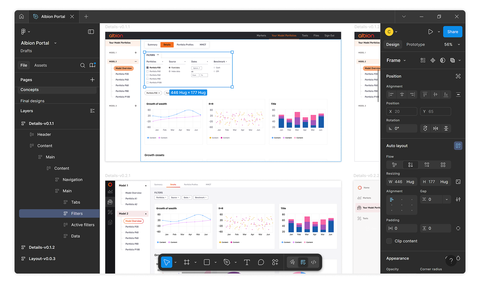
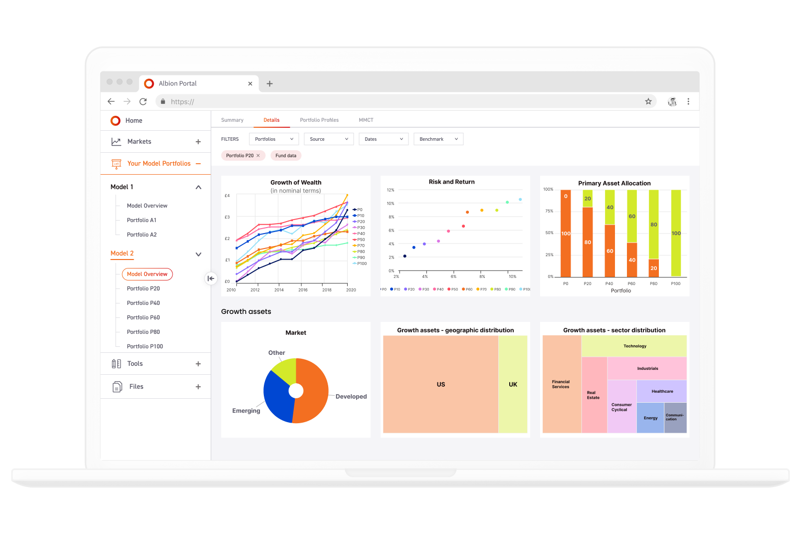
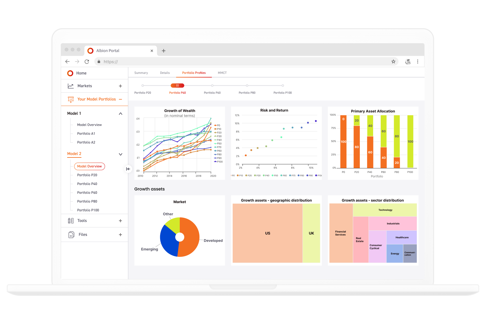
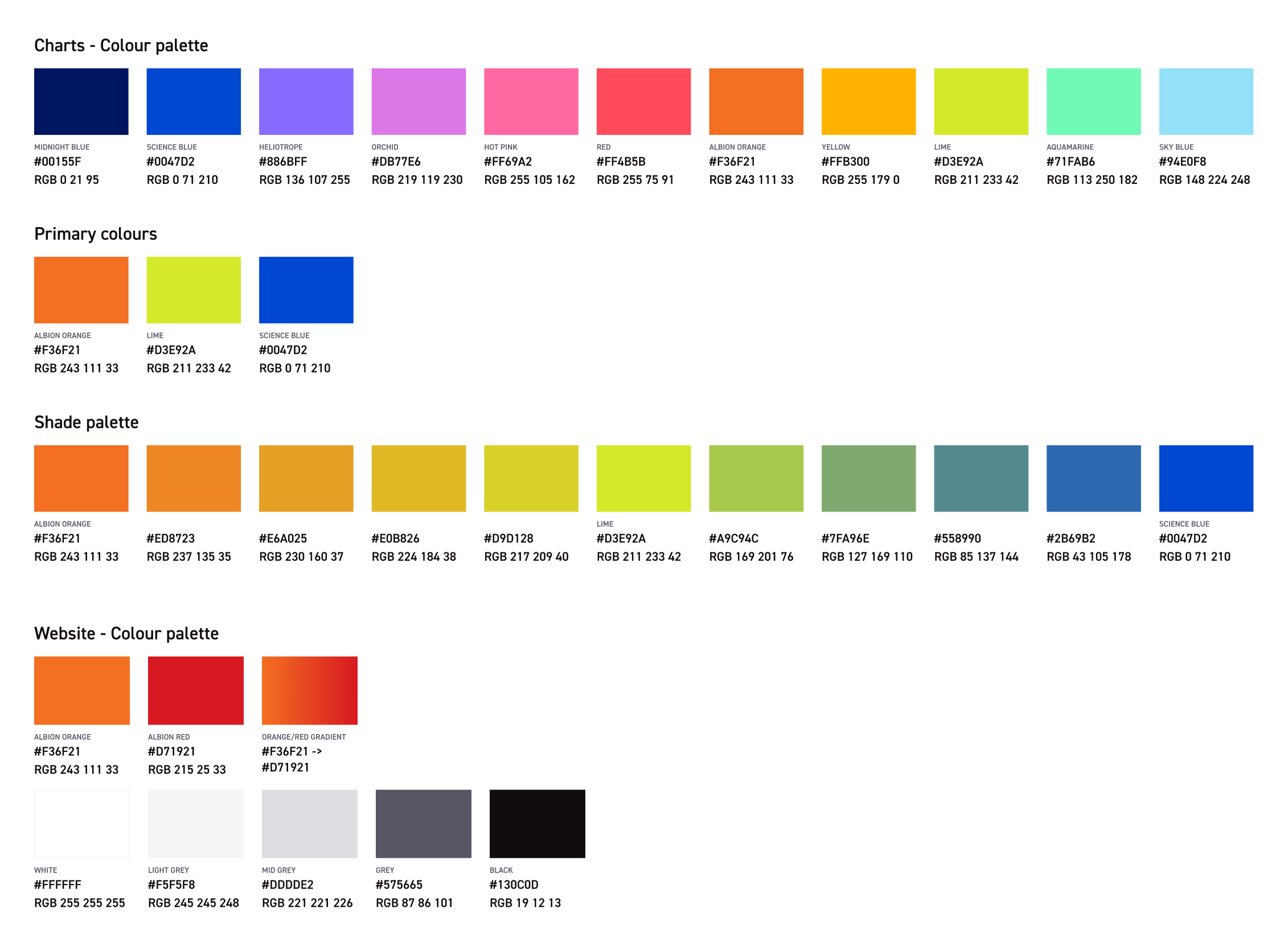
Several layers of navigation were inevitable, so ensuring the interface and content were understandable was a top priority. The core challenge was:
This required a thoughtful balance of visual hierarchy and clarity of navigation, especially for users who aren’t financial experts.

I created wireframes in Figma to explore and compare navigation options, prioritising clarity and hierarchy. Using Albion’s branding guidelines, I applied consistent colour and typography to make the portal feel like a cohesive extension of the main website.
I acted as the lead UI/UX designer, responsible for:
The final UI structure and design ensured low cognitive load and helped users navigate quickly and confidently. The updated colour system made data evaluation intuitive and consistent.