British Geriatrics Society
Following a rebrand, The British Geriatrics Society (BGS) required a full website redesign to align with its updated visual identity and better support its diverse professional audience.
Go to websiteThe existing website was content-heavy, visually dated and difficult to navigate, making it hard for users to quickly find relevant resources and guidance. The core challenges of the redesign were:
Modernise the interface, improve clarity and hierarchy, and ensure the site feels credible, accessible and easy to use.
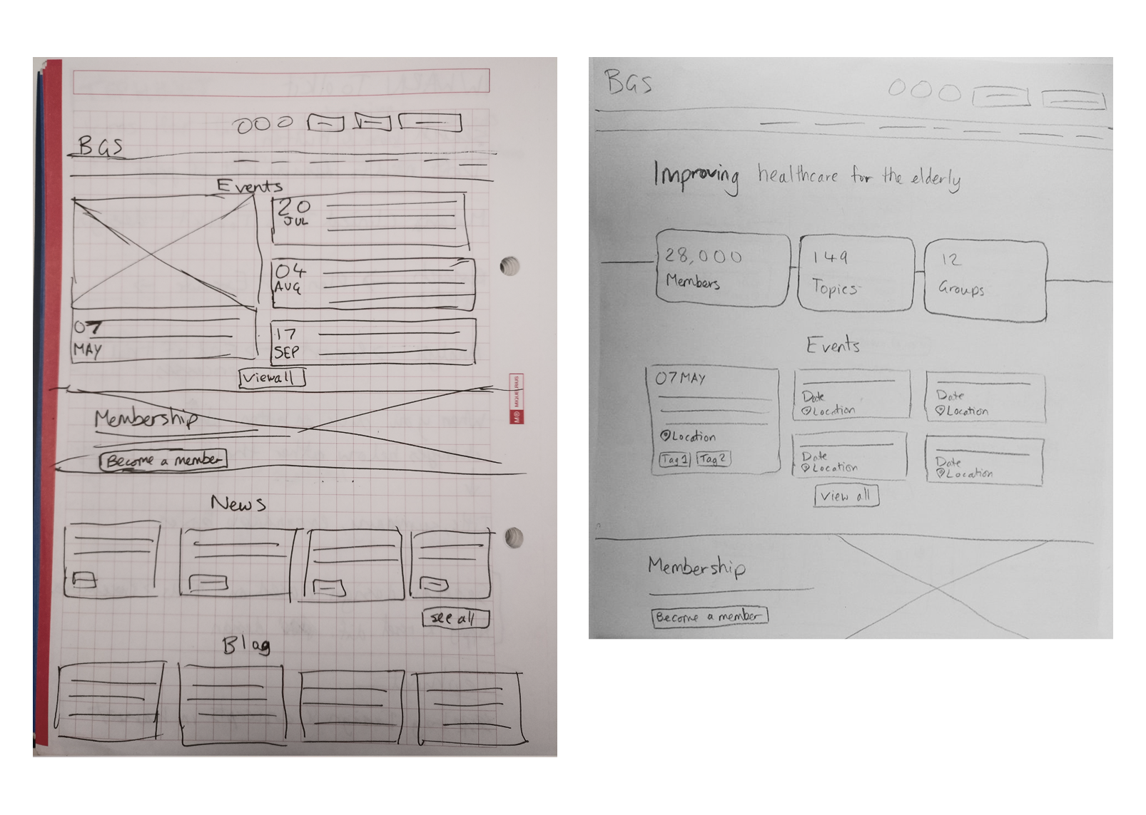
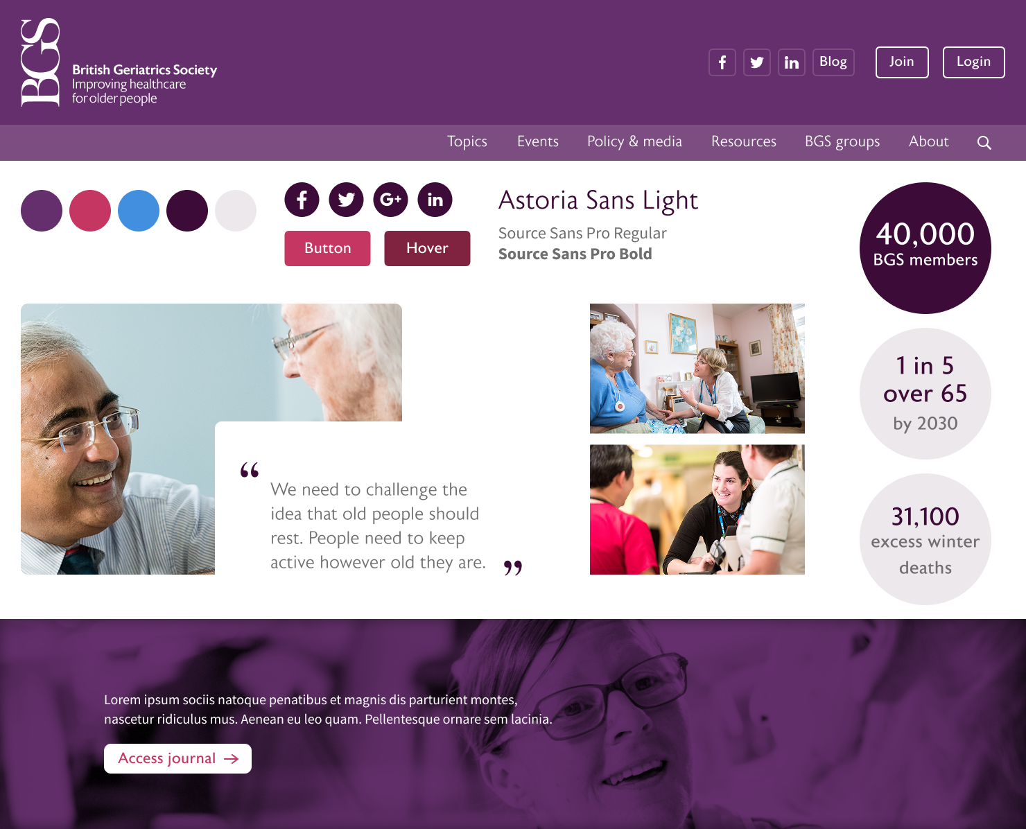
I began by creating a moodboard to explore how the refreshed BGS brand could translate into a digital environment. The focus was on:
This visual exploration helped define the tone of the redesign before moving into detailed UI work.
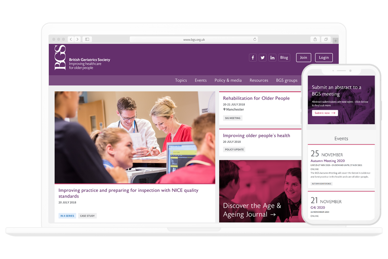
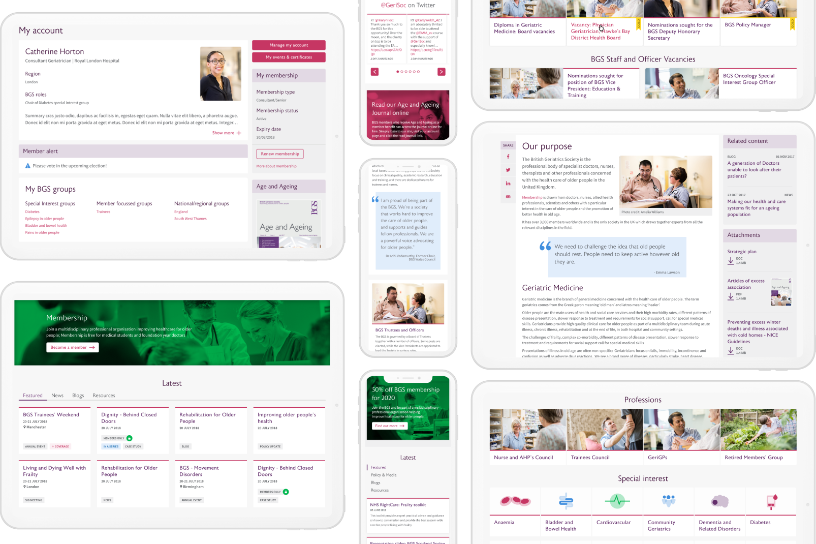
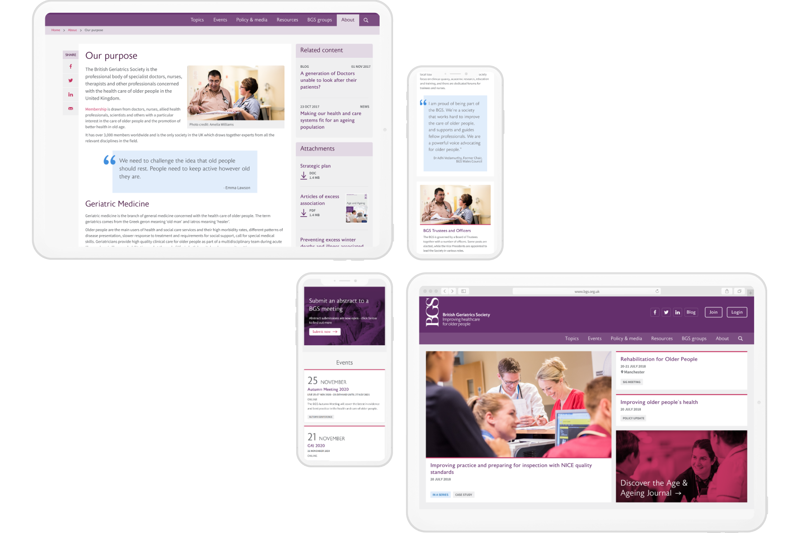
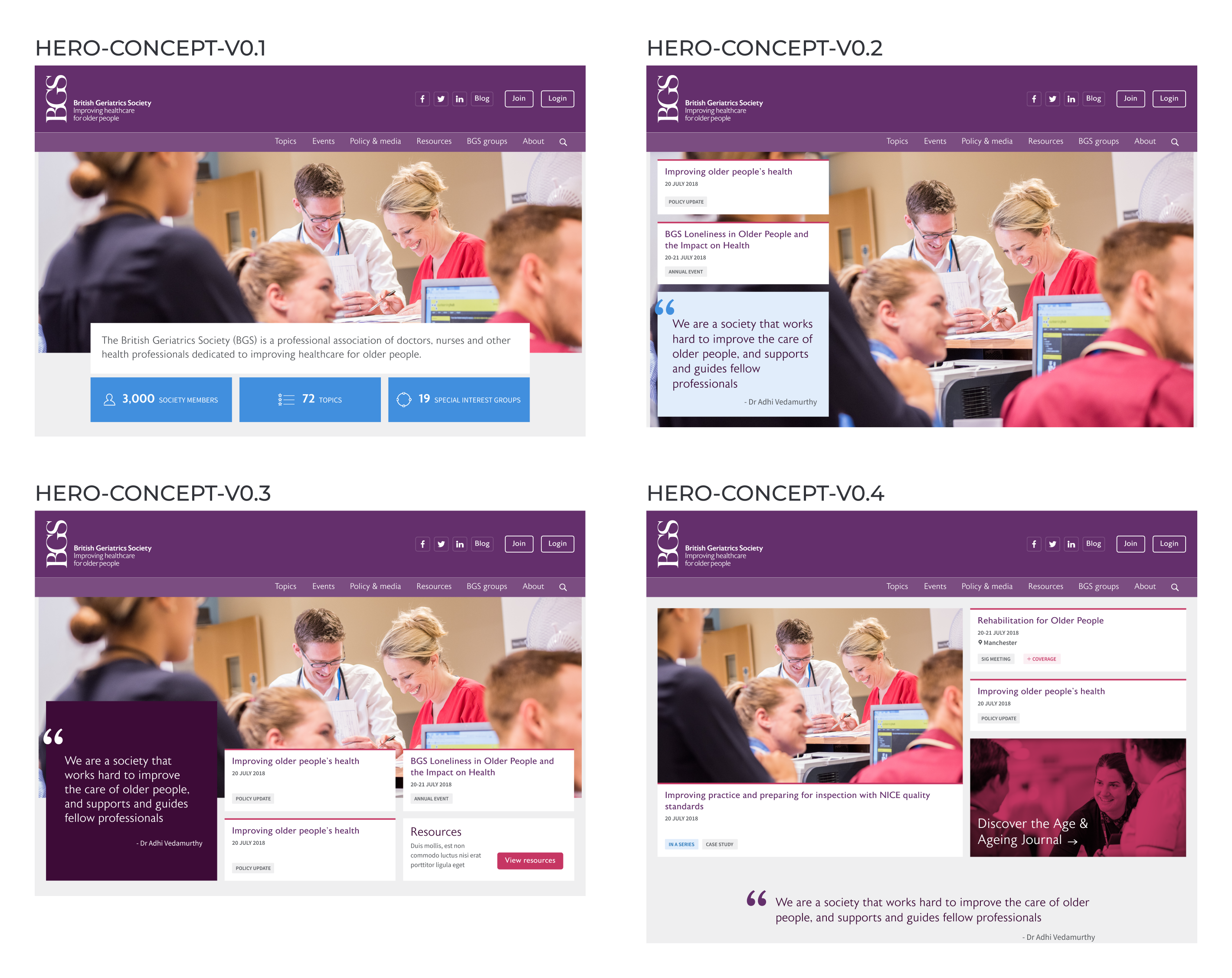
The final UI designs focused on clarity, accessibility and structure. Key design decisions included:
The result is a modern, professional interface that better reflects BGS’s authority while making the website easier and more pleasant to use.
The redesigned interface provides a clearer, more accessible experience for BGS members and visitors. It aligns closely with the updated brand identity, improves content discoverability, and creates a flexible foundation for future growth.