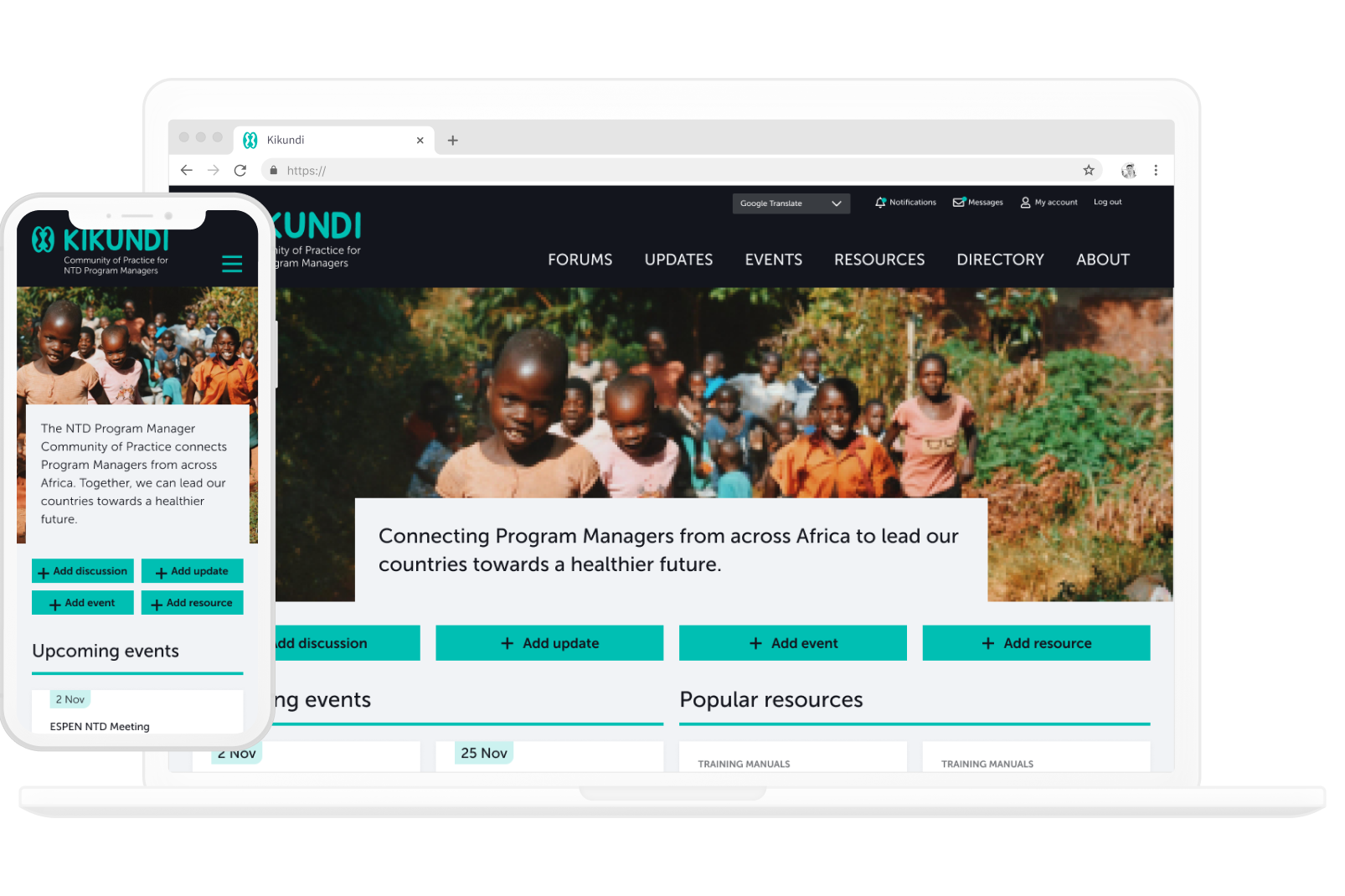
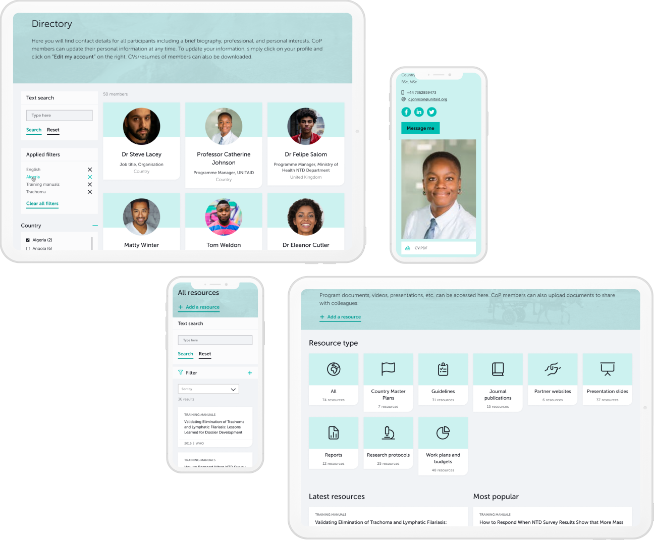
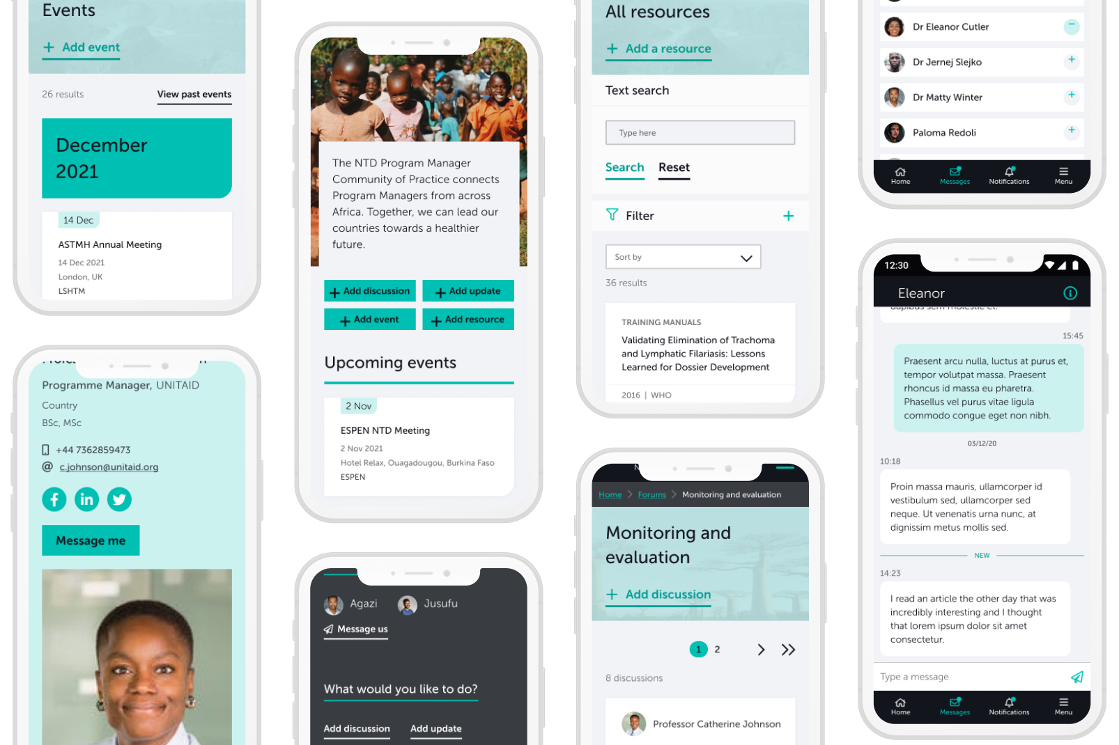
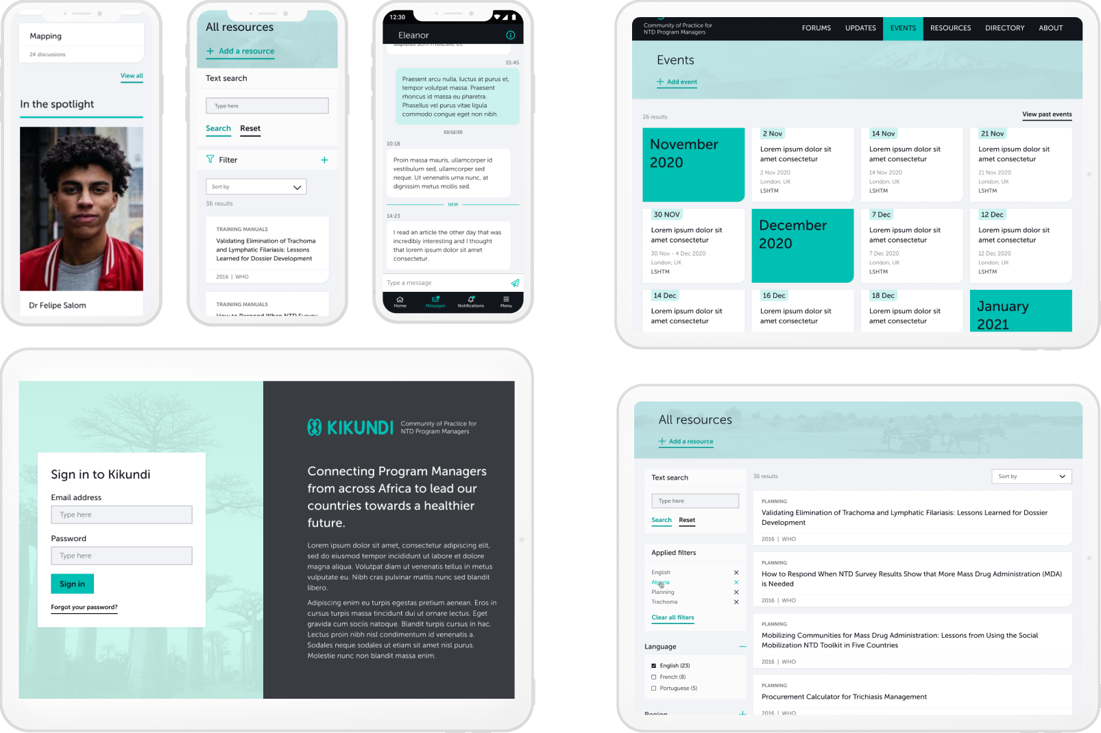
The Challenge

The challenge was twofold:

  1. Develop a brand identity that feels welcoming, inclusive, and trustworthy
  2. Design a clear, intuitive experience for the app and website, that supports community coordination

The app and website needed to feel accessible to a broad audience while still supporting structured organisation, events, and communication.

Logo & Brand Identity

I began the project by designing the Kikundi logo and visual identity, grounding the brand in the idea of connection and togetherness.

I explored both the Adinkra symbols Nkonsonkonson and Aya during the logo design process, ultimately selecting Nkonsonkonson for its representation of unity and community. Aya, or fern, symbolises endurance and resourcefulness, and helped inform the conceptual direction. I also experimented with natural, handwritten typefaces to introduce a more human and approachable element to the identity.

The colour palette was chosen to reinforce a sense of warmth and approachability, while ensuring the whole logo remains legible and functional in a mobile interface. This brand system informed the UI design, ensuring consistency across screens.

Visual Design & UI Language

I crafted a visual style that conveys community warmth and clarity, while maintaining usability standards. The result balances aesthetics with purpose, ensuring that users feel connected and confident while navigating the app.

Key app areas

Home
A snapshot of recent activity, community groups, and upcoming events, acting as the hub for daily engagement with easy-access buttons to contribute your own content.

Directory
An extensive directory of all members, to allow easy connection and collaboration.

Messaging
A streamlined interface for setting up new groups and efficient communication.

Forum, events & resources
Clear layouts and extensive filtering to allow users to find all the relevant information they need.

Outcome

A vibrant, approachable platform that supports user connection and knowledge sharing. The final design:

  • Helps users easily organise and participate in community activities
  • Reduces cognitive load through clear navigation and information structure
  • Builds a welcoming, community-centric visual identity