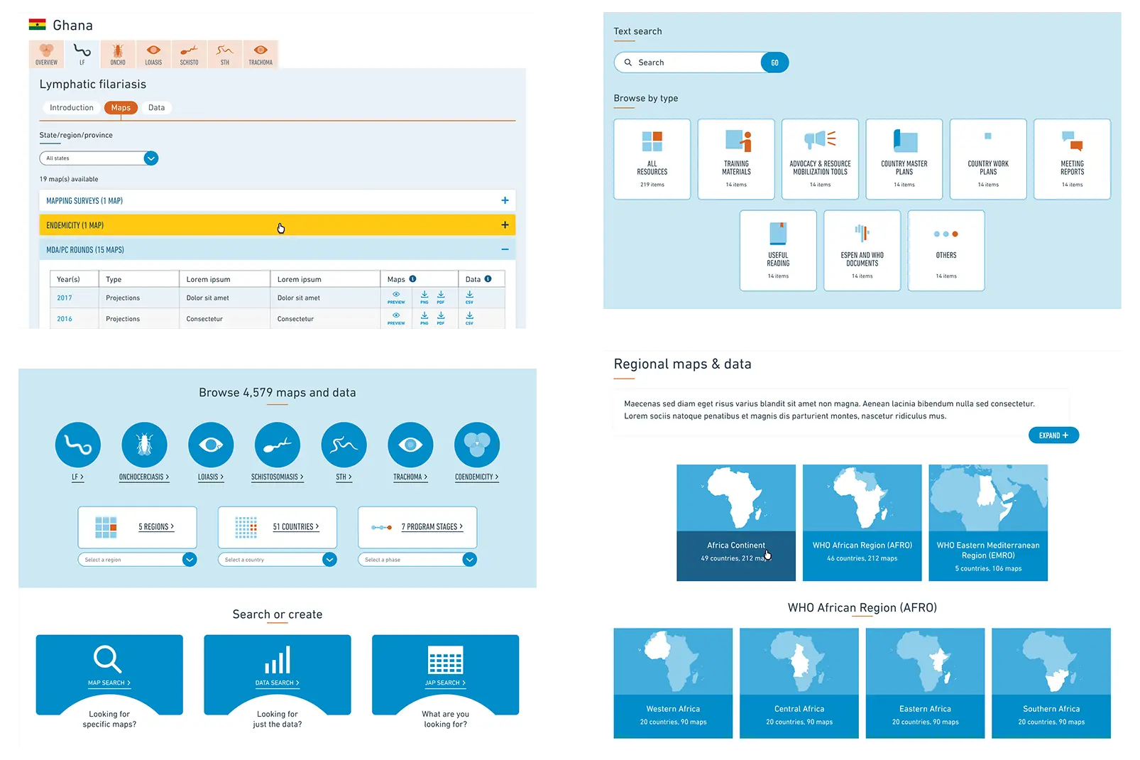
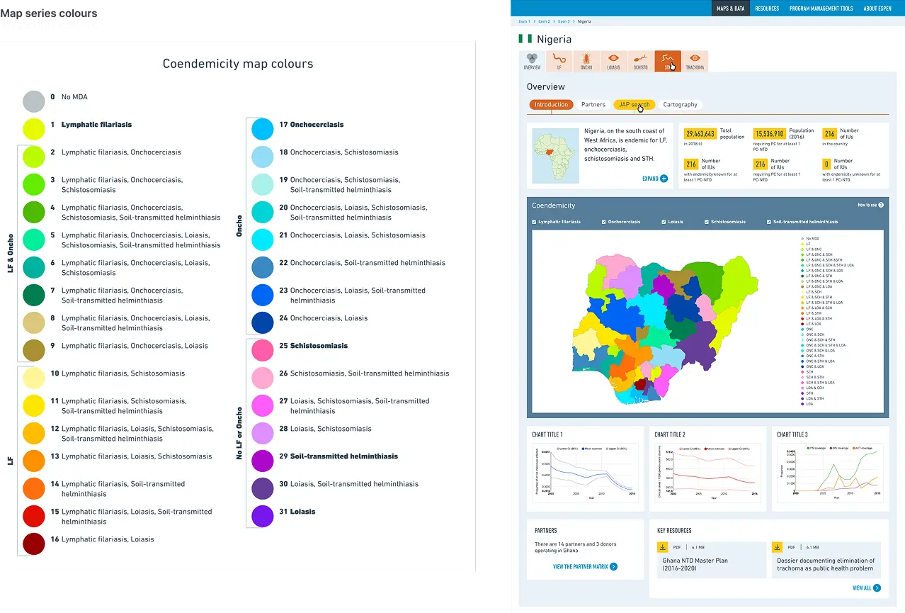
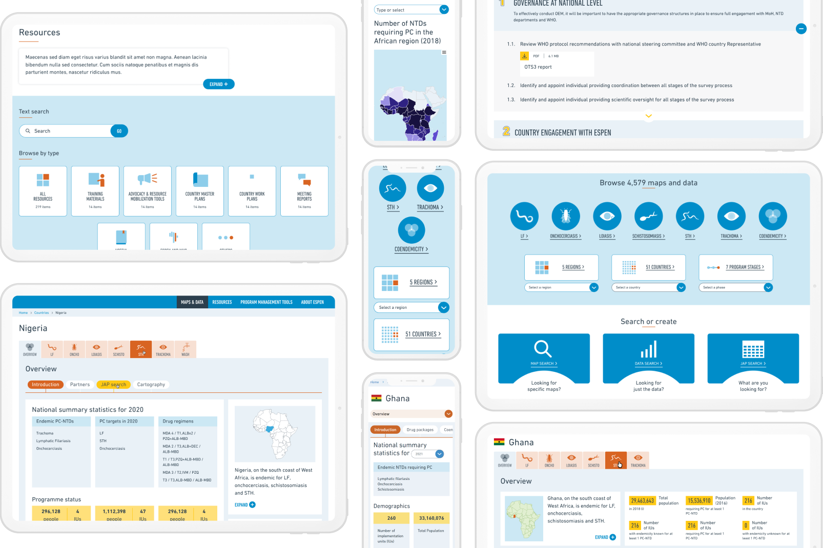
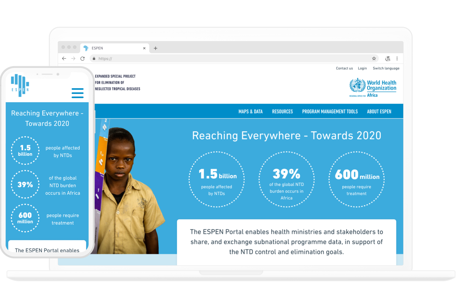
ESPEN is designed to strike the perfect balance between professional and engaging, to ensure the site comes across as trustworthy and a reliable source of data, allowing the data to speak for itself and to ensure users can easily find exactly what they're looking for.​ The importance and relevance of the data is promoted by making it clear how the data is separated, and gently guiding the user through their journey. The strong use of icons along with minimal copy is intended to allow the user to avoid thinking more than necessary, and combined, they make for a clearer and more engaging experience.
A lot of time was dedicated to the UI and UX of the data-heavy dashboards, and colour palettes of the various maps and charts that would be displayed. The main deliverables were the website designs with a design system for the developers to follow while building the website, as well as icons and a multitude of colour palettes.