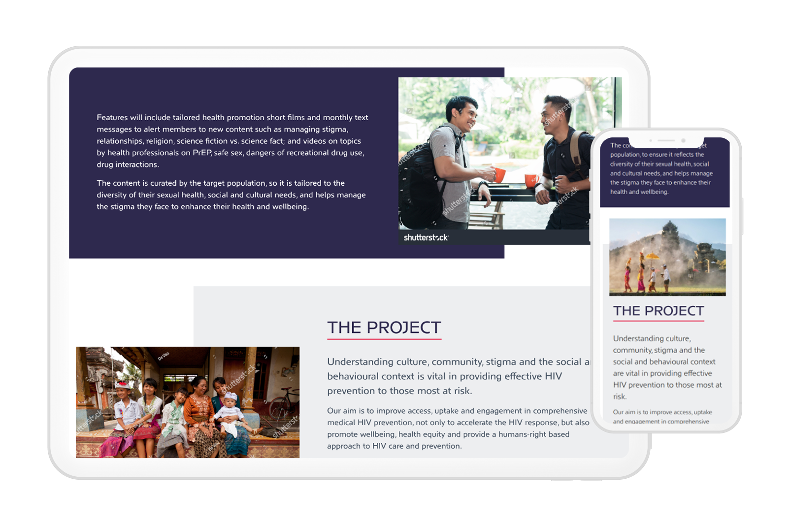
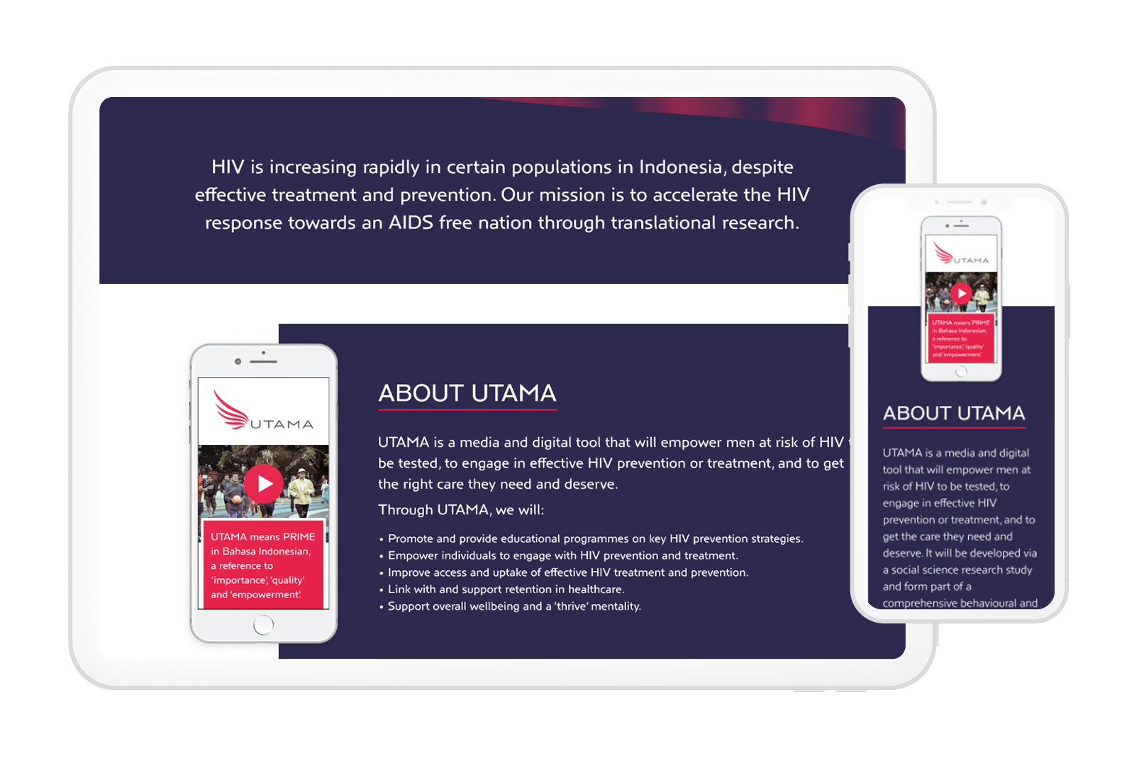
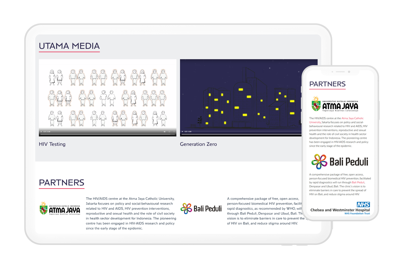
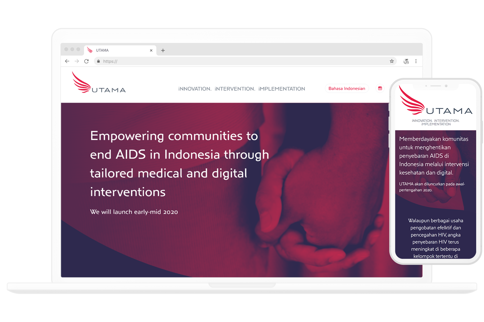
Communicate a serious health topic in a way that feels empowering, not daunting.
I began by developing the logo and brand identity for UTAMA, informed by the idea of empowerment, the meaning of “utama” in Bahasa Indonesian. This led to a bold yet timeless colour palette, centred around a bright red commonly associated with the fight against AIDS, and a clean, classic logo designed to help reduce stigma.

Drawing inspiration from the brand palette and typeface, I designed the website in Figma, aiming for a clean, modern interface that feels approachable while remaining sensitive to the subject matter. An initial concept (left) felt too light and flowery, so we decided to hone in on the primary red of the logo and a deep navy, to bring a more masculine feeling. The final design has a stronger and simpler colour palette and shape, allowing the content to take the spotlight.
Once the visual direction was approved, I built the site in Webflow, translating the designs into a fully responsive experience that looks and performs consistently across all devices. Bahasa was built in as an alternative language option.
The result was a welcoming, accessible landing page that communicates essential information without stigma or complexity.